Sunday, 1 May 2011
Degree Show Publicity
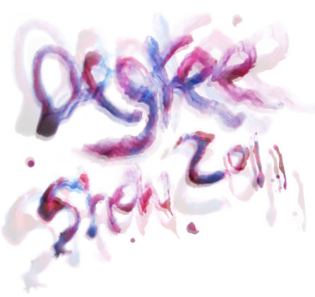
The degree show marks the end of the academic year and is a time to celebrate the achievements of outgoing graduates. We were set the brief to create the promotional material for our Hull School of Art and Design degree show. The theme was 'creativity' so i decided i wanted to express this through typography. I used a combination of coloured inks and watercolours to create some experimental type. This will be the main feature on my poster:


Friday, 15 April 2011


ISTD (Not Just Fleurons)
My end result was a set of 10 educational but typographic flashcards using some of the phrases from the plant growth song. I made the cards leaf shaped to emphasise the plant/garden theme. These were individually created and the set is then tied together with an orange ribbon bow. The cards can be used as an educational game as each one is numbered. Children are encouraged to try and put the process of plant growth in the right order. To check if they’re right they have to turn the leaves over. I’m really pleased with the final outcome. I think they look really cute as a set. I enjoy creating experimental typography so this kind of brief worked for me. The bright colours and the shape of the cards represent gardens really well. If the cards were to be made then they would be printed on very thick card and die-cut into a leaf shapes.
ISTD - 'A plant will grow' by Lauren Mayer
My plants are growing, from the seeds down in the ground
Soon they'll be showing how the plant world gets around
Just plant a seed, and when you're done
Give it air and water and lots of sun
And in a couple of weeks or so,
You know a plant will grow!
A seed sprouts a root, isn't that cute?
My plants are growing, from the roots and the seeds down in the ground
Soon they'll be showing how the plant world gets around
It grows some roots, which uncoil
To soak up nutrients from the soil
And in a couple of weeks or so,
You know a plant will grow!
Plants grow a stem, every one of them!
My plants are growing, from the stems to the roots from the seeds down in the grownd
Soon they'll be showing how the plant world gets around
At first just a tiny stem is seen
You know it's growing 'cause it's green
And in a couple of weeks or so,
You know a plant will grow!
Look what the stem achieves - it's growing some leaves!
My plants are growing,
from the leaves to the stems to the roots from the seeds down in the ground
Soon they'll be showing how the plant world gets around
The leaves get bigger by the hour
Then it might grow fruit, it might grow a flower
And in a couple of weeks or so,
You know a plant will grow!
From the fruit or the flower
to the leaves
to the stem
to the roots
from the seeds down in the ground
And now you know - just how a plant will grow!
I've chosen some of the key lines from the song instead of using all of it because it's quite long!
ISTD (Not Just Fleurons)
Here's the children's rhyme i've chosen to represent the process of plant growth but in a fun way. It's by Lauren Mayer and it's called 'A plant will grow'! Cute :)
ISTD (Not Just Fleurons)
So I decided I wanted to focus on how plants grow. I wanted to explore how a tiny seed can develop into a beautiful flower with colourful petals and strong leaves. I did some research into the process of plant growth and felt that the different representations were very boring. As this brief is mainly typographic I decided I wanted to represent this process in a more creative way.
I began by working out what my target audience would be. In the end I decided that I would aim my piece/s at primary school children. (5+ years). At this age children begin to learn the process of plant growth, so I felt that creating some kind of learning/educational piece using rhyming phrases seemed right to me.
I found a perfect rhyming song about plant growth online by Lauren Mayer. I began by experimenting with the phrases, keeping in the mind the target audience and the theme of the ISTD brief.

ISTD (Not Just Fleurons)
For this typographic based brief the theme is to consider plants in the biggest possible way, to take into consideration colours, size, smell, feel, texture, associations, and botanical names. The brief is asking for an "eye catching" and informative outcome that interprets an celebrates plants and the concept of the garden (metaphors) and its role in our lives.
The brief states:
‘The many great gardens of the world, of literature and poetry, of painting and music, of religion and architecture, all make the point as clear as possible: the soul cannot thrive in the absence of a garden. If you don’t want paradise, you are not human; and if you are not human, you don’t have a soul.'
Thomas Moore
Some see gardening as a metaphor for life. Whether it is a plant or two on a window sill in an urban apartment, a vegetable plot in a suburban garden, the yard of an American home, the ornate gardens of the Château de Versailles, the botanical gardens of Kew or the Zen-inspired gardens of Japan, the constant in all gardens is the presence of plants.
Friday, 25 March 2011
Disturbia Typography
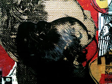
I created some experimental type from the song lyrics in disturbia. I chose "a disease of the mind". Here i floated the letters in some bubbly water. I wanted to recreate the texture of cells and the spreading of a disease over the letters. The shape of the bubbles help to mimic this:


Rihanna's Disturbia
To develop my phobias project further I started off by looking at music. I wanted to find some song lyrics that i could experiment with. I chose "Rihanna's, Disturbia". The song lyrics relate well to phobias. Disturbia represents Rihanna's state of mind. In the video she is contemplating or being disturbed by something, just like the way in which phobias disturb your mind. There are some great song lyrics to experiment with like "a disease of the mind" and "I feel like a monster". I've gathered some imagery from the video for inspiration. I'm now going to create some experimental typography based on these lyrics :)


Revisting Phobias
After completing all the tasks set by my teacher for my self initiated, i'm now starting to look into the possible routes i can develop my project into. I've been brainstorming some ideas and i've come up with some broad areas i want to look into:
- Horror Posters/Film Festivals
- Music with fear like lyrics
- Charities that help people overcome their phobias like Anxiety UK
- The illness side of phobias. I want to look at the ways in which phobias can develop into mental illnesses
I'm now going to research into these areas and find a certain theme i can explore further.
Friday, 18 March 2011
RSA Paul Smith Stamps
This brief was set by the RSA. We had to design a set of stamps that would celebrate either British Fashion or British Firsts. I chose fashion as my theme and focused purely on Paul Smith. Paul Smith is one of the UKs most successful Fashion Designers and i felt that a combination of his his iconic stripes and fashion illustration would work well on a stamp. I started off by illustrating some of his key pieces:


After doing these illustrations i felt i needed more texture in my work so i chose to create some collaged fashion illustrations. These work much better and have formed the final basis for my stamps:

Phobia - Richard Vanek Inspired photography
Here's my attempt at a Richard Vanek inspired photograph. I've chosen to represent 'claustrophobia' in his style. I like his contrast of light and dark and his use of shadows and ive tried to incorporate this into my shot:


British Heart Foundation Photography Competition
The annual red for heart photography competition organised by the British Heart Foundation took place this January. The theme was to consider what 'heart means to you'. It was also the 50th birthday of the British Heart Foundation so the theme of celebration could be considered. I chose to photograph a red tealight candle. This links in with the celebration as candles are used in birthdays. The finished shot has a romantic, love like style.


Phobias - My own photography
I used some of my images from the Richard Vanek inspired work but added coloured lights in the background. I love the contrast of the dark hands and coloured lights in these photographs. I think they evoke 'claustrophobia' really well.


Paula Scher Solarium
Check out this completely insane installation of one of Paula Scher’s paintings in Queens Metropolitan High School:


Phobia - Research piece
We had to express a piece of research in a unusual way. I chose to represent my first piece of research into all the emotions associated with phobias. I created an A1 piece of hand-drawn words and photographed it. I was mainly inspired by Paula Scher's hand drawn type for this task.


Derek Gores
I was inspired by Derek Gores, a fashion collager when creating my mixed media piece. I love his work:


Phobias - Mixed Media
The mixed media task was to create an image using a different method. I chose to represent the fear of birds again 'Ornithophobia'. I created a collaged bird wing as the fear is based around a birds flight and the wings swooping in. I used old magazine and newspaper cuttings to create the layered feathers. This has given a really nice texture.


Richard Vanek
About Richard Vaneks 'A Night Mood' series:
"The moments when the night is deep and you see only in black and white. When all is quiet so much that you can hear how slowly water flows in the heating. Those are the moment when you realize how fragile all this is.
"The moments when the night is deep and you see only in black and white. When all is quiet so much that you can hear how slowly water flows in the heating. Those are the moment when you realize how fragile all this is.
You remember moments when you were small and ill in bed. When times slowed down and you notice the smallest times drifts, the quietest sounds. When your hands where big like balloons, when your head was in fever.
These moments are simple images, which we forget very fast, but when we feel important moments the come back to our mind. We enjoy those memories, memories which reminds the basic in us. These moments when we do not play our role, when we do not pretend who we are. Those moment when we just are.
To view his photos click here http://www.richard-vanek.eu/projects/
I'm representing 'claustrophobia' in the style of Richard Vanek. I like his contrast of light and dark and his use of shadows.
I'm representing 'claustrophobia' in the style of Richard Vanek. I like his contrast of light and dark and his use of shadows.
Phobia - Barbara Mensch inspired photography
Here's my attempt at a Barbara Mensch inspired photograph. As i live near the the river humber i chose the humber bridge as my main subject. As Gephyrophobia' is based on the fear of crossing a bridge over water i felt that the river humber would work well. I'm pleased with my final shot. I think the fear is evoked well through the colours. When i took these photos it was a misty day so this has helped with creating a creepy atmosphere.


Barbara Mensch
For my first photograph i chose to represent the fear of bridges 'gephyrophobia'. After looking into Barbara Mensch's Brooklyn Bridge series i felt her eerie style and emotional colours would suit this phobia. Heres a bit of info on Barbara Mensch:
"Shortly after graduating from Hunter College in 1978, the photographer Barbara Mensch moved from SoHo to the top floor of a walk-up on Water Street near the South Street Seaport. The charming but decrepit 19th-century brick building was shared by several artists, who sought the low rents and the seaport’s industrial grittiness. Ms. Mensch and her neighbors now own the building, which they have renovated. Although Ms. Mensch is most widely known for her photographs of the old Fulton Fish Market, to which two books have been devoted, she has also photographed the Brooklyn Bridge for nearly 30 years. As Mont Sainte-Victoire was for Cezanne, the bridge has been a constant in her life and her art. Capturing the bridge at all times of the day and the seasons of the year, she has learned as much about the river and the weather as about the bridge’s structure."


"Shortly after graduating from Hunter College in 1978, the photographer Barbara Mensch moved from SoHo to the top floor of a walk-up on Water Street near the South Street Seaport. The charming but decrepit 19th-century brick building was shared by several artists, who sought the low rents and the seaport’s industrial grittiness. Ms. Mensch and her neighbors now own the building, which they have renovated. Although Ms. Mensch is most widely known for her photographs of the old Fulton Fish Market, to which two books have been devoted, she has also photographed the Brooklyn Bridge for nearly 30 years. As Mont Sainte-Victoire was for Cezanne, the bridge has been a constant in her life and her art. Capturing the bridge at all times of the day and the seasons of the year, she has learned as much about the river and the weather as about the bridge’s structure."

Phobias - Photography
This was quite an extensive task. We had to create 3 final photographs, 2 in the style of another photographer and 1 in our own style. Firstly we had to research into photographers who's topics could be applied to our themes. After doing this i chose to create 2 photographs, 1 in the style of Barbara Mensch and the other in the style of Richard Vanek. Both these photographers themes evoke darkness and fear really well and i felt that their styles would fit phobia photography really well.
Phobias - Colour Palette
We were briefed to create a colour palette based on our chosen themes. I again chose to represent 'hylophobia' which is the fear of forests. I used a printmaking technique for this task. The colours have worked really well using this technique. The have combined together well and the ink creates a bark like texture.


Phobias - Textures
We were briefed to create a minimum of 50 textures based on our chosen areas. I chose the fear of forests 'hylophobia' and looked into things like grass, soil, wood, cobwebs and plastic patterns, colours and textures. Here's some of my textures:


Phobias - Experimental Phrase
Our second task is to create an experimental phrase based on our chosen themes. I created a few phrases for this. Firstly i chose to represent the fear of birds 'ornithophobia'. I created the phrase 'a little bird told me' using bird seed. I inverted the type in photoshop but i wasnt happy with the final result so i chose to look into the fear of spiders 'arachnophobia' instead. I used the phrase 'Incy Wincy Spider' and did some experimental ink letterforms and textured letterforms using angel hair. I chose my spiders type as my final for this week.


Phobias - Experimental Word
In order to start on our self initiated projects we are being set different tasks each week. Our first task was to create an experimental word based on our chosen areas. My area is phobias so i decided that i would represent a phobia through type. I chose 'ablutophobia' which is the fear of washing. I printed out some letterforms and floated these in a sink of soapy water. After playing around with the photos in photoshop the result is quite dark and the bubbles overlapping the letters create a really nice texture. The way in which the letters are floating also help to convey a wave like shape.


Subscribe to:
Posts (Atom)